The mysterious Voynich manuscript has finally been decoded

Artículos, arte, Ciencia, diseño, Enlaces, ilustración, Naturaleza, Sin categoría

History researcher says that it’s a mostly plagiarized guide to women’s health.

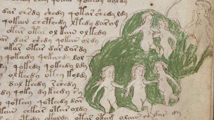
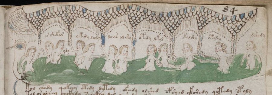
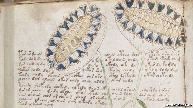
Since its discovery in 1912, the 15th century Voynich Manuscript has been a mystery and a cult phenomenon. Full of handwriting in an unknown language or code, the book is heavily illustrated with weird pictures of alien plants, naked women, strange objects, and zodiac symbols. Now, history researcher and television writer Nicholas Gibbs appears to have cracked the code, discovering that the book is actually a guide to women’s health that’s mostly plagiarized from other guides of the era.

Gibbs writes in the Times Literary Supplement that he was commissioned by a television network to analyze the Voynich Manuscript three years ago. Because the manuscript has been entirely digitized by Yale’s Beinecke Library, he could see tiny details in each page and pore over them at his leisure. His experience with medieval Latin and familiarity with ancient medical guides allowed him to uncover the first clues.

After looking at the so-called code for a while, Gibbs realized he was seeing a common form of medieval Latin abbreviations, often used in medical treatises about herbs. «From the herbarium incorporated into the Voynich manuscript, a standard pattern of abbreviations and ligatures emerged from each plant entry,» he wrote. «The abbreviations correspond to the standard pattern of words used in the Herbarium Apuleius Platonicus – aq = aqua (water), dq = decoque / decoctio (decoction), con = confundo (mix), ris = radacis / radix (root), s aiij = seminis ana iij (3 grains each), etc.» So this wasn’t a code at all; it was just shorthand. The text would have been very familiar to anyone at the time who was interested in medicine.


Further study of the herbs and images in the book reminded Gibbs of other Latin medical texts. When he consulted the Trotula and De Balneis Puteolanis, two commonly copied medieval Latin medical books, he realized that a lot of the Voynich Manuscript’s text and images had been plagiarized directly from them (they, in turn, were copied in part from ancient Latin texts by Galen, Pliny, and Hippocrates). During the Middle Ages, it was very common for scribes to reproduce older texts to preserve the knowledge in them. There were no formal rules about copyright and authorship, and indeed books were extremely rare, so nobody complained.

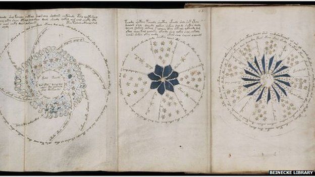
Once he realized that the Voynich Manuscript was a medical textbook, Gibbs explained, it helped him understand the odd images in it. Pictures of plants referred to herbal medicines, and all the images of bathing women marked it out as a gynecological manual. Baths were often prescribed as medicine, and the Romans were particularly fond of the idea that a nice dip could cure all ills. Zodiac maps were included because ancient and medieval doctors believed that certain cures worked better under specific astrological signs. Gibbs even identified one image—copied, of course, from another manuscript—of women holding donut-shaped magnets in baths. Even back then, people believed in the pseudoscience of magnets. (The women’s pseudoscience health website Goop would fit right in during the 15th century.)

The Voynich Manuscript has been reliably dated to mere decades before the invention of the printing press, so it’s likely that its peculiar blend of plagiarism and curation was a dying format. Once people could just reproduce several copies of the original Trotula or De Balneis Puteolanis on a printing press, there would have been no need for scribes to painstakingly collate its information into a new, handwritten volume.

Gibbs concluded that it’s likely the Voynich Manuscript was a customized book, possibly created for one person, devoted mostly to women’s medicine. Other medieval Latin scholars will certainly want to weigh in, but the sheer mundanity of Gibbs’ discovery makes it sound plausible.

See for yourself! You can look at pages from the Voynich Manuscript here.

Fuente: Arstechnica.com

Type on the campaign trail

Artículos, arte, derechos, diseño, Enlaces, Fotografia, ilustración, Sin categoría, tipografía

US designers contribute type, posters, badges and branding to the Hillary Clinton cause


From the outset, the Hillary Clinton campaign has enlisted the help of some of the United States’ best designers to portray and propagate her messages.

The Hillary Clinton campaign identity designed byMichael Bierut and his team atPentagram.

HillaryforAmerica

Pentagram’s Michael Bierut and his team designed the campaign identity in 2015 which used Sharp Type foundry’s typeface Sharp Sans Display No.1 as the foundation for their identity system. The foundry’s co-founder Lucas Sharp saw this application as an ‘opportunity to take the design further. We had drawn a tightly spaced, Lubalin-esque geometric sans that looked really good big. Now we wanted to draw a version with utility and versatility, that could work in any situation.’


‘Stronger Together’ is set in Sharp Slab for Hillary.

StrongerTogether

Bierut’s extensive identity system would be used by all manner of people on the campaign trail – from professionals to volunteer organisers – which meant that the detailed instructions laid out in the style guide for tracking a display face used for other applications were unlikely to be followed. Sharp writes, ‘It occurred to us that a serious presidential campaign needs a typeface that can work in any situation.’ As a result, Sharp Sans grew to include Sharp Unity for Hillary, Sharp Slab for Hillary, Sharp Slab Extrabold, Sharp Slab Book, Sharp Stencil for Hillary and Sharp Stencil.


Examples of Sharp Slab for Hillary,Sharp Unity for Hillary, Sharp Stencil for Hillary, Sharp Slab Extrabold, Sharp Slab Book and examples of several of the fonts in use on a campaign bus.

type_comp

Jennifer Kinon of design and branding agency Original Champions of Design (OCD) stepped away from her agency role to become Hillary Clinton campaign’s design director. Kinon was tasked with rolling out and extending from the identity designed by Michael Bierut (Pentagram) that used the Sharp Sans family. Both Bierut and Sharp have praised Kinon’s work online and many of her designs have gone viral including the ‘Love Trumps Hope’ image.


A selection of Hillary merchandise.

HillYes

Other design led initiatives in support of Hillary Clinton include The Forty-Five Pin Project and 30 Reasons with work by designers such as Matt Dorfman, Elizabeth Resnick and Craig Frazier.


30 Reasons posters by Elizabeth Amorose, OCD,Bonnie Siegler andLarkin Werner.

30Posters_comp


Vote.

Hill_vote


Hillary for Americavideo showing Pentagram’s identity in action.

https://player.vimeo.com/video/169739384

Eye is the world’s most beautiful and collectable graphic design journal, published quarterly for professional designers, students and anyone interested in critical, informed writing about graphic design and visual culture. It is available from all good design bookshops and online at the Eye shop, where you can buy subscriptions and single issues.

Joan Claret, exposición póstuma ‘Del mosaic al laberint’

Artículos, arte, diseño, Enlaces, ilustración, Sin categoría

Del mosaic al laberint es la primera exposición dedicada a Joan Claret, uno de los artistas más emblemáticos del arte abstracto catalán de posguerra, tras su muerte. La muestra, que se puede visitar hasta el 7 de mayo en el Edificio Miramar de Sitges, hace un recorrido a través de su legado pictórico, acentuando algunos aspectos de la obra del artista. Se incluyen cuatro piezas suyas procedentes de la prestigiosa Col·lecció Bassat.

Joan Claret, exposición póstuma 'Del mosaic al laberint'

El próximo 25 de marzo se presentará Del mosaic al laberint, una exposición póstuma del pintor referente del arte abstracto catalán Joan Claret, y se podrá ver hasta el 7 de mayo de 2017 en el Edificio Miramar de Sitges. Esta muestra se plantea como un juego de construcción de una escenografía fiel a la cosmología particular del artista, al tiempo que plasma la evolución técnica y creativa de Claret a lo largo de su trayectoria. La selección incluye cuatro piezas del autor procedentes de la prestigiosa Col·lecció Bassat.

Joan Claret, exposición póstuma 'Del mosaic al laberint'

Del mosaic al laberint
En el primer ámbito de la exposición, Plànol, se muestran las primeras obras abstractas de Claret. Partiendo del principio del mosaico, el artista juega con la yuxtaposición de pequeñas piezas geométricas bidimensionales. No surgen, sin embargo, de un proceso aditivo y mimético sino de cruces de líneas que crean espacios de escala cambiante. Son preciosas miniaturas o inmensos paisajes. La paleta de Claret ya se ha definido, con sus grises y sus azules de una frialdad cristalina.

De ahí se pasa a un segundo ámbito donde sobresale la blancura atmosférica pero precisa de Claret, evocando la transparencia, La Llum. Las claridades se manifiestan de manera dominante, pero nunca deslumbrante. Visualmente, se producen desplazamientos, dinamismos, ordenaciones multiplicadas como dentro de un caleidoscopio. Siguiendo su propio camino, Claret coincide con algunos efectos del Op Art pero, a diferencia del objetivismo lúdico de aquel movimiento, él se manifiesta a través de una dimensión misteriosa, trascendente.

Estos espacios se van volviendo más arquitectónicos y conforman el tercer ámbito, Arquitectures. A pesar de la ligereza de su trazo y la calidad aérea del color, hay una tendencia hacia la profundidad, generando volúmenes. Surgen caminos, recorridos, andamios, estructuras, y llega un momento donde aparecen columnas, pilares, visiones de templos magníficos, de un barroquismo psicodélico que puede recordar a Borromini.

Por último, la exposición termina con un pequeño ámbito titulado El Fil d’Ariadna, un paralelismo con la línea como base constructiva del estilo de Claret, que nos ayudará a salir del laberinto. Siguiendo el Hilo de Ariadna, al cabo de los años Claret encuentra de nuevo la posibilidad de presencia humana real, la mujer. Es la compañera, la musa y el sujeto erótico que la guía y la anima.

Joan Claret, exposición póstuma 'Del mosaic al laberint'

Joan Claret, referente del arte abstracto catalán
Joan Claret se licenció en Filosofía y Letras por la Universidad Autónoma de Barcelona en 1957, tras cursar estudios de arquitectura. Perfeccionó sus estudios en la Sorbona de París y, en acabarlos, se adentró en el campo de la pintura. Reconocido dentro de la corriente constructivista del arte catalán y considerado una de las figuras claves del arte abstracto de posguerra, Claret, consiguió su primera exposición en 1959 en la sala Gaspar. En los años sucesivos su obra se internacionaliza gracias a una serie de exposiciones en Tokio, Bonn, Sao Paulo y Londres, entre otros. Esta progresiva difusión internacional del trabajo de Joan Claret creció entre los años 1964 y 1965 con la inclusión de su obra en una exposición colectiva itinerante por Estados Unidos, englobada dentro de los grupos Modern Spanish Painting y Seven Catalonian Artists. Esta presencia entre lo más destacado de su generación es una consecuencia directa de haber ganado, en 1962, el primer premio del Concurso Internacional de Dibujo Joan Miró.

Joan Claret, exposición póstuma 'Del mosaic al laberint'

Inauguración
Día: Sábado 25 de marzo
Hora: 19 h
Lugar: Edificio Miramar (C/ de la Davallada, 12, 08870 Sitges, Barcelona)

→ www.joanclaret.com

Fuente: Revista Graffica

Eggers in the sky, Callahan’s streets, Tim Burton, rubber-stamped Chilean horror and a Brit in Japan

Artículos, arte, Cine, diseño, Enlaces, Fotografia, ilustración, Sin categoría, tipografía

Here are a few photobooks that have recently caught our attention … each reviewed in no more than 140 characters.

Matías Celedón’s The Subsidiary haunts readers with a horror story made using rubber stamps.


Celedón designed each rubber stamp and individually stamped each page. He used an antique Trodat stamp set he bought at a Santiago bookstore.
Top: Spread fromUnderstanding the Sky by Dave Eggers.

BooksReceived_5


The Subsidiary (2016) is Chilean author Matías Celedón’s first novel to be translated into English (translation by Australian writer Samuel Rutter).

BooksReceived_4

Dave Eggers’ Understanding the Sky weaves together photographs and dialogue to tell a heart-warming story about a man who wants to fly.


Understanding the Sky, 2016, by Dave Eggers. The book includes over 150 photographs, all taken by the author.

BooksReceived_3

BooksReceived_2

Written in Japanese, Andrew Pothecary’s Alphabet Secrets Revealed by a British Designer is a Brit’s eye view of English characters.


Author Andrew Pothecary’s spread about the letter ‘V’. Pothecary argues that there are certain connections, meanings and associations linked to each letter.

BooksReceived_7


Cover of Tokyo-based graphic designer Andrew Pothecary’s Alphabet Secrets Revealed by a British Designer(2016).

BooksReceived_6

Ian Nathan’s Tim Burton: The Iconic Filmmaker and his Work chronicles the fantasy film director’s career with vibrant still captures.


Spread showing a still image from Burton’sFrankenweenie (2012). The images within the book are from the archives of The Kobal Collection.

BooksReceived_11


Spread showing aEdward Scissorhands (1990) poster and a headshot of the movie lead Johnny Depp.

BooksReceived_10


Cover of Tim Burton: The Iconic Filmmaker and his Work, 2016. The book was designed by Sue Pressley and Paul Turner, Stonecastle Graphics Ltd.

BooksReceived_9

Harry Callahan: The Street features the American photographer’s less well known street photography, in black-and-white and in colour.


Wells Street, Chicago (left), Old Town, Chicago (right) (1949).

BooksReceived_15


Aside from straightfoward street photography, Callahan is known for his experimental work, such as Atlanta(1985), a dye transfer print.

BooksReceived_16


Harry Callahan: The Street (2016) was edited by Grant Arnold and published by Black Dog Publishing in partnership with the Vancouver Art Gallery. On the cover is Callahan’sProvidence (detail, 1967). Photographs of books in ‘Books received #24’ by Mariam Dembele.

BooksReceived_12

Eye is the world’s most beautiful and collectable graphic design journal, published quarterly for professional designers, students and anyone interested in critical, informed writing about graphic design and visual culture. It is available from all good design bookshops and online at the Eye shop, where you can buy subscriptions and single issues.

A new life for old type: Pentagram’s identity for Pink Floyd Records

arquitectura, Artículos, arte, diseño, Enlaces, Fotografia, ilustración, musica, Sin categoría, tipografía


Pentagram partner Harry Pearce talks us through designing an identity for Pink Floyd Records and a lavish 27-disc box set for the band

Pentagram’s alphabet for Pink Floyd Records, based on the stencil lettering from the cover of the band’s 1977 album, Animals

Aubrey Powell and Storm Thorgerson’s record sleeves for Pink Floyd are some of the most memorable of all time. Working under the name Hipgnosis, the pair’s surreal imagery inspired generations of designers and have become enduring symbols of the band’s music. Think of Pink Floyd, and it’s near impossible not to imagine the prism on the cover of Dark Side of the Moon or the bright pink pig on the sleeve of Animals.

Pink Floyd’s music and visual output is the subject of a major retrospective opening at London’s V&A Museum in May. In November last year, the band released a 27-disc box set of early singles and recordings on their record label Pink Floyd Records.

The identity for Pink Floyd Records was designed by Pentagram partner Harry Pearce and his creative team and is based on the stencil lettering from the cover of Animals. Designer Johannes Grimmond worked with Pearce to create a complete alphabet based on the original letterforms, giving the label a distinctive logotype. The alphabet can also be used as a headline font on new releases and merchandise.

Pink Floyd Records logotype. The alphabet can also be used as a headline font
Edition numbering for record label releases

Pearce says he initially experimented with creating something new for the label but decided that the lettering “just had a wonderful quality to it.”

“The stencil somehow feels evocative of the stencilling on all their equipment and their boxes…. It’s such a wonderful, idiosyncratic bit of type that we just felt it deserved a bigger life than it had already,” he told CR. “[The band and Powell] loved the idea and it’s right in the middle of the canon of all of their work.”

Creating a complete alphabet based on the design was quite a challenge. “It was originally made to be on a 12″ LP … when you take that typeface and make it very small, which it often had to be, all of the inter-character work, the huge contrast between the stencil cuts through the lettering was so narrow that you reduce it down and it just sort of closes up,” says Pearce. “That was one challenge and the fact was that we just didn’t have that many letters, so we did an analysis of the forms of letters that were there and built a system on that.”

Pearce and his team also designed The Early Years 1965 – 72, which features early singles and previously unreleased recordings from Pink Floyd’s archives.

The black-and-white outer casing takes inspiration from the Bedford van that the band once drove around in (see gallery above). Discs are packaged in seven volumes – one for each year between 1965 and 72 – and each one features a painting by artist John Whiteley (an old friend of Powell’s) on its cover.

Whiteley created the artworks during the band’s early years but – like much of the material on the box set – they have never before been released. “Those beautiful works of his have never seen the light of day so that was a lovely continuity there,” says Pearce. “They aren’t modern versions of his work, they were made at the same time [as the recordings].”

A2’s Typewriter font is used throughout the packaging, offering a more contemporary take on traditional typewriter lettering. “We thought that was relevant, as even though [the box set] is old material, we’re cataloguing it today, so it isn’t just all nostalgia.”

Booklets contain lyrics and photographs from Pink Floyd’s archives, many of which have never before been published. The box set also features some lovely added touches. The spine of each volume bears a unique reference number and a word representing that year’s output. Roger Waters came up with the words for each year and each one is intercepted with a forward slash, providing another reference to the white stripe on the Bedford van.

Pentagram worked closely with Aubrey Powell on the design of the identity and the box set. “He was a bit like our filter really. He’s so intimate with the band, we took his advice on the directions and ideas [that were presented to him] and he took them to the band. Him being a designer himself, it was a really sympatico relationship,” says Pearce.

As a long time fan of Pink Floyd’s, Pearce describes the project as “a complete joy”.

“When I was a teen in the 1970s listening to that stuff, holding that 12″ sleeves in my hands, never did I dream I’d one day be working with some of that material,” he says. “Some of that music was founding stuff for me back in the 70s, so it’s a very precious thing to do and we took immense care on this project.”

“That’s probably another reason why we honoured the lovely lettering on that original Animals album [for the identity],” he adds. “We could have imposed our own style on to this … we could have invented a new logo, but this just seemed to resonate so much more – the fact that we were honouring and using things that already existed and giving them a new and extended life.”

Pearce has also written an ‘outro’ for forthcoming Thames & Hudson book Vinyl. Album. Cover. Art: The Complete Hignosis Catalogue.

You can read our interview with Aubrey Powell about the work of Hipgnosis and his partnership with Thorgerson here.

Fuente: www.creativereview.co.uk

El MOMA lanza un curso online gratuito que explora el trabajo de 7 maestros de la pintura abstracta de postguerra

Artículos, arte, diseño, Fotografia, ilustración, Sin categoría

El Museo de Arte Moderno de Nueva York, MOMA, ha lanzado un curso online gratuito donde se explora el trabajo de 7 maestros de la pintura abstracta de postguerra. A través de ocho sesiones, el centro de arte da la oportunidad de conocer y analizar la obra de de 7 artistas pertenecientes a la Escuela de Nueva York a través de los fondos del museo.

El MOMA lanza un curso online gratuito que explora el trabajo de 7 maestros de la pintura abstracta de postguerra

¿Alguna vez te has preguntado cómo Agnes Martin equilibró la perfección y la imperfección en sus composiciones reticuladas? ¿Por qué Jackson Pollock fue apodado ‘Jack the Dripper’? ¿Cómo Mark Rothko trató de hacer llorar a los espectadores? ¿O cómo suena una pintura de Willem de Kooning? En definitiva, ¿quieres saber cómo algunos de los artistas más célebres del siglo XX hicieron sus pinturas abstractas?

Cabarets del Cielo y del Infierno en París

arte, diseño, Fotografia

A finales del Siglo XIX en la época de la Belle Époque, una serie de corrientes relacionadas con el ocultismo, el esoterismo y el culto a la muerte comenzaron a florecer entre la alta sociedad de las ciudades europeas más importantes. Era incluso extraño que tras una cena de gala no hubiese una sesión espírita o séance en la que se “jugaba” con la invocación de espíritus y demás seres o entidades de ultratumba. Con este caldo de cultivo tan peculiar, en París surgieron una serie de cabarets muy distintos a los que normalmente nos vienen a la cabeza al nombrar lugares como el Moulin Rouge y Folies Bergère.

Games people play – V&A Museum of Childhood, Cambridge Heath Road, London

Artículos, arte, diseño, Enlaces, Juegos, Sin categoría

Game Plan: Board Games Rediscovered

V&A Museum of Childhood, Cambridge Heath Road, London E2 9PA
Curator: Catherine Howell, Curator of Toys and Games at the V&A Museum of Childhood
Exhibition design: Thomas Matthews
8 October 2016 – 23 April 2017

From Senet to Pandemic, the Museum of Childhood’s exhibition ‘Game Plan’ covers five thousand years of fun with board games

If there’s one thing to take away from the ‘Game Plan: Board Games Rediscovered’ exhibition is that playing board games is a serious business, writes Clare Walters.

Stories exist of kingdoms being lost over a dice game. There have even been instances of people wagering limbs on the result of a game of chess. And negative associations with gambling have resulted in dice themselves being shunned. In the late eighteenth and early nineteenth centuries children were encouraged to use ‘teetotums’ – spinning tops with several sides decorated with numbers or letters – instead of dice.

Los libros de la Bauhaus GRATIS!

arquitectura, Artículos, arte, diseño, Enlaces, Fotografia, ilustración, musica, Sin categoría, tipografía

Los aportes más valiosos al mundo del diseño sin duda los dio la Escuela de la Bauhaus. Se inauguró en Alemania en 1919 y revolucionó los parámetros académicos burgueses del arte de aquella época, estableciendo una nueva visión de lo estético y funcional entre arquitectos, escultores, pintores, etcétera.